
The ember needs neighbours
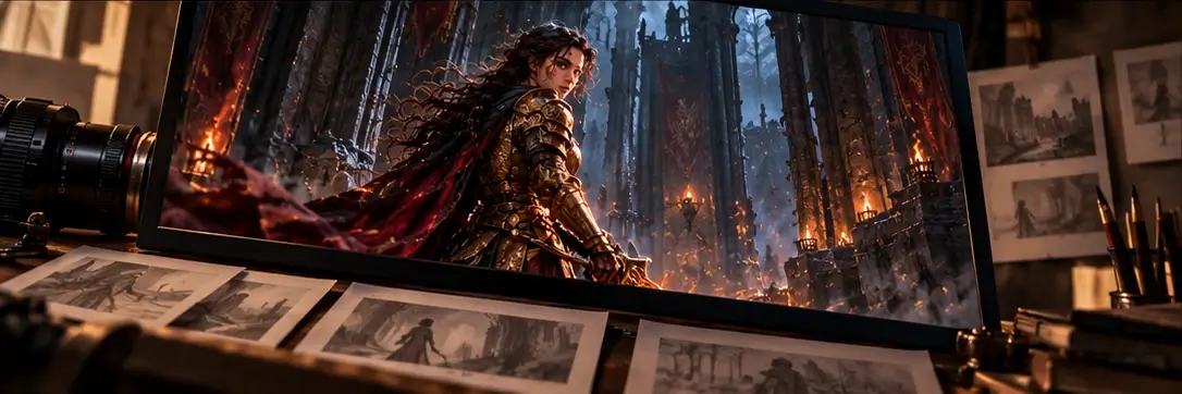
Orange does not feel warm by itself. It feels warm beside the blue-grey stone, drained sky and dull iron proposed for Shadow & Ember. The knight's lantern can become a small island of reassurance because the surrounding sanctuary gives it contrast. Make the entire scene orange and that relationship disappears. A palette study should therefore begin with a scene, not a row of attractive swatches. What sits beside the ember matters as much as the ember's own hue, especially when several surfaces catch its light.
Write a small palette contract
For this concept, warm light could mean a place being cared for, while pale violet belongs to a guardian's active ward. That is a contract with the player. It needs a limited vocabulary and deliberate exceptions. A rusty door can remain orange because it is visibly a material, not a glowing signal. An orange magical barrier is harder to explain if the lantern has already taught the opposite meaning. Keep a simple scene inventory: protection, threat, interaction and decoration. Look for collisions before polishing the colour grade.
A warning must survive orange
Colour should carry emphasis without carrying the whole instruction. Suppose the guardian's ward changes as the knight approaches. Pair that change with a visible tightening of the ring and a distinct stance, so the cue remains understandable when hues are difficult to distinguish. Check it in greyscale and against a bright ember effect. A warning that disappears under the player's own attack is not dependable. Increasing saturation everywhere will not fix the competition; reduce the decorative layer or give the warning a different shape and timing.
Let restoration alter the balance
A restored sanctuary need not exchange one global filter for another. Warmth can spread through specific acts: a lit stair, a repaired brazier, a room where someone has hung fabric against the cold. Leave the upper vault blue and the old scorch marks dark. Those remaining contrasts make the care visible. They also preserve places where the lantern still has a purpose. If restoration makes every corner equally inviting, the world loses both its memory and the small pleasure of carrying light into somewhere that needs it.
Check the promise in motion
Review the palette along a route that includes exploration, a guardian encounter and the return to shelter. Ask what viewers believe is safe, active or reachable before naming the colours. A mistaken interpretation may expose a lighting problem rather than a palette problem: bloom can merge separate signals, and fog can flatten their brightness. Colour rules are useful scaffolding, not laws for every scene. A deliberately unsettling chamber may break them, but the break should create an intelligible story question instead of quietly changing the controls the player thought they understood.
Explore Shadow & Ember