A scene is a set of priorities
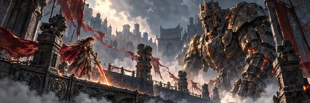
An encounter can contain remarkable artwork and still be difficult to understand. The problem often begins when every element asks for the same amount of attention. In Shadow & Ember, the knight, guardian, lantern and arena must form a clear visual hierarchy. The player needs to recognise an immediate threat before appreciating a carving in the wall. That hierarchy can change as an encounter unfolds, but the change should be intentional. Composition is therefore a practical part of encounter design as well as an artistic one.
Silhouette before decoration
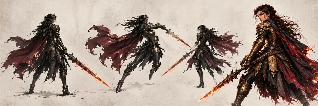
A character’s pose should remain meaningful when seen against a busy background. The guardian’s raised arm, lowered head or shift in balance can communicate an approaching action before light and particle effects appear. Beginning with silhouette helps preserve that message through later detail. The same principle applies to the knight and her companions. Distinct roles need distinct postures and proportions, allowing the player to understand the party at a glance. Decoration adds character after the essential information is already clear, rather than competing with it.
Give a decision enough time
A warning matters only if the player has time to interpret it and choose a response. The duration between a guardian’s preparation and its attack should reflect the kind of decision being asked for. A simple movement can demand less time than coordinating several companions or identifying a change in elemental protection. Consistency also matters. If the same cue announces several unrelated dangers, players learn to distrust it. Clear timing supports a challenging encounter because failure can lead to useful understanding instead of confusion about what happened.
Colour with a specific job
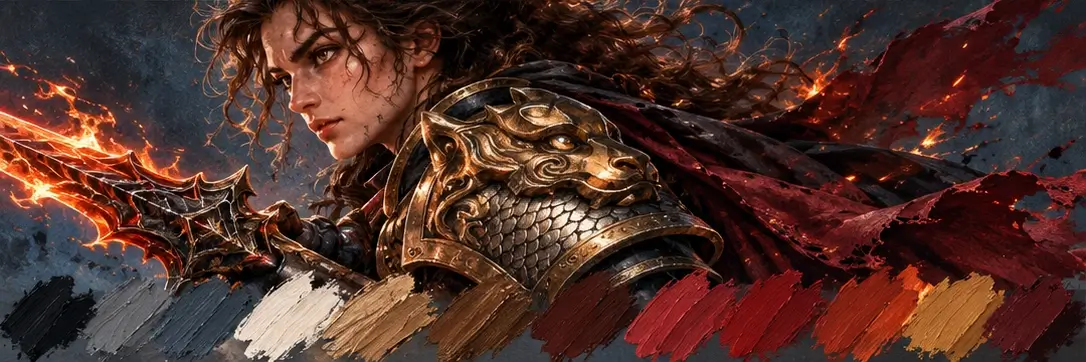
Light and shadow are central to the atmosphere of this world, but their practical roles must remain legible. Warm light can identify the ember’s protection, while a controlled change in the guardian’s wards signals an opportunity. Additional colour should be introduced carefully, with enough contrast to remain readable across the scene. The objective is a coherent vocabulary that does not depend on reading a long explanation. Alternative cues, including shape and motion, help preserve the message when colour alone would be insufficient.
Polish begins with a useful question
During revision, the most valuable question is often simple: what does the player need to notice now? The answer guides changes to framing, contrast, movement and sound. It may lead to removing an effect, shortening a decorative animation or moving an important cue away from the edge of the screen. These decisions can make a scene feel more polished even when they add nothing new. This design study treats attention as a limited resource. Protecting it gives the player more room to enjoy both the challenge of an encounter and the world in which it happens.
Explore Shadow & Ember